Agency / 3D
Canada at Expo 2020 Dubai - 3D
The project
The agency won the bid to design and develop the digital experience of the Canadian pavilion at Expo 2020 Dubai. Most of the team at Akufen worked on it for months to make the magic happens! I worked on three different aspects of the project: multiple 3D experiences called Traces, a 3D trailer for their social medias and motion videos for digital scrollable frescoes showing Canada's life and people across seasons. I made a case study about each project.
I will talk about a few of these experiences here, but you can find a very in-depth case study about Traces I did for Akufen on Medium: https://medium.com/@akufen/canada-at-expo-dubai-2020-virtual-experience-case-study-79620808da79
Traces is a multisensorial exhibition designed by KANVA for the Canadian Pavilion at Expo 2020 Dubai. It's made of multiple pieces of art, indirectly showing the impact of humankind on nature.
We worked in close collaboration with KANVA to fulfil our mission, which was to transcend the physical works while translating their messages and artistic direction into immersive experiences.
My contribution to the project
I defined and produced all the 3D experiences based on high level concepts, and animated some in After Effects, such as The Sanctuary that you can see below, when interactive 3D was not needed
We worked closely with developers to have the most efficient workflow from 3D to live version (we defined the best way to export scenes for web, what needed to run live in 3D in the browser, and what could be videos, …), and also to iterate on renders and experiences when we were facing technical limitations
Challenges
Working on Traces was really challenging. I learned 3D on my own, and it was my first real project, all the ones I did before were either for school or personal projects.
Our mission was to transcend the physical works by taking advantage of the possibilities brought by digital while translating their artistic direction and messages. We didn't want to just offer some kind of 3D player to see the art pieces, we wanted to create experiences around it.
Achieve the expected render
The first piece of art I worked on was The Jewel. We wanted to let the user discover it by making the cube rotate on itself. This one was pretty challenging shader wise. It was a lot of tests and tries to approach the texture of the real one, full of cracks, air gaps, tiny details and imperfections. I learned a lot about texturing for this one, and used quite a lot of tricks, like adding physical bubbles with glass materials to fake air gaps, and adding physical cracks inside.
The perfect workflow would be to then bake the texture, meaning printing the textures with its lighting, shadows etc., Then just import a basic cube with this texture in WebGL, but as the cube is full of refraction, we couldn't do it that way. The developer had to try and reach the scene render, from my reference, and my 3D model without texture. Kudos to him because the live version is pretty, pretty close!
Find the best medium
At first, we thought that every experience would run in real-time, but we quickly found out that some didn't need to. The Nearness, for example, a journey inside the vertical landscape of the original work, was perfect as a rendered video, as the user triggers the journey by scrolling. We added a little pan linked to the mouse movement to add a bit of dynamism, and it did the trick!
The Sanctuary is a place where humans don't belong. The whole experience is based on the fact that the user's cursor is stuck outside the border of the experience. We also made it as a video, done in After Effects this time, using a 3D camera moving and moving 2D layers in 3D.
3D environments in After Effects are pretty handy. You just have to put a camera, turn on 3D on your layers, and let the magic happen. By avoiding using Blender, I didn't have to think about lighting, as it's faked by a simple layer that slowly heats up (incrementally increasing its opacity). I added a seamless multilayered background that translates from right to left, and looped birds rotations. The final animation is a perfect loop.
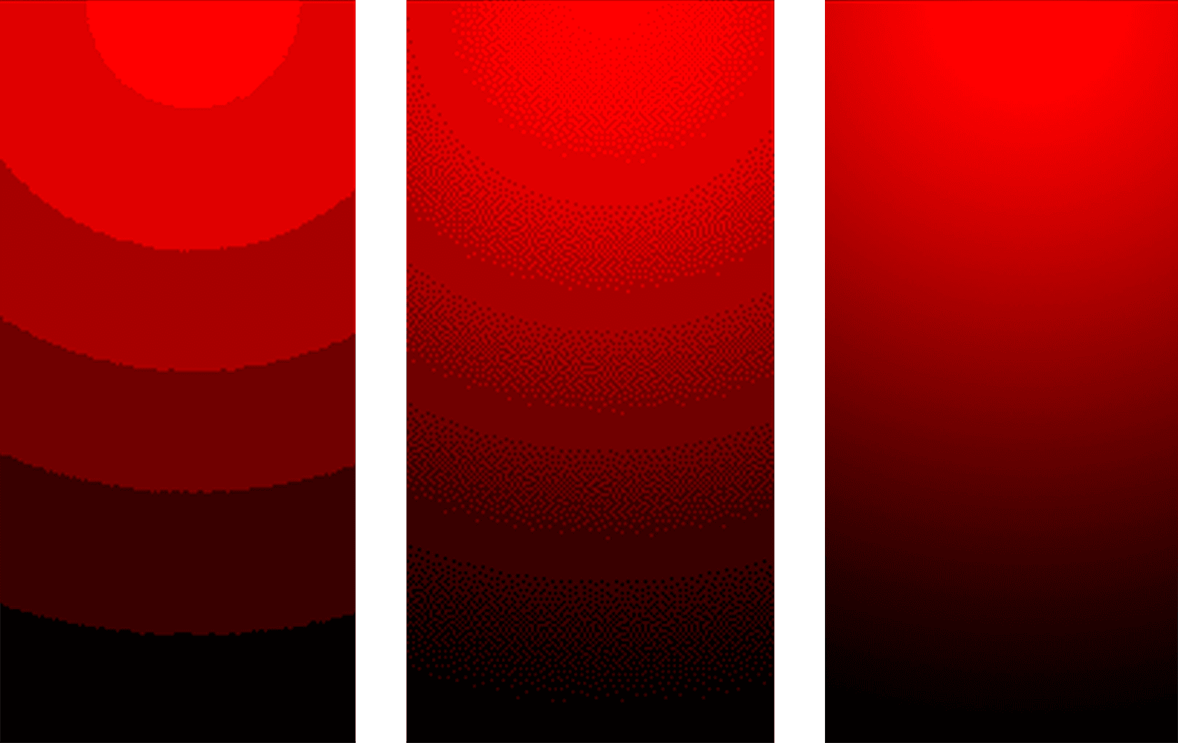
The first versions of the animation didn't have that incrementally increase in lighting, it was smoother, but I had to remove it because of color banding issues.

This example (Thanks Wikipedia for the image!) is exaggerated, but it's a perfect way to explain it. Color banding is the artifacts you see on the left and middle image. It's a visible color change in a gradient. This issue is generally linked to the bit depth, the number of color values an image can contain. For example, h264, the most common codec for videos nowadays, allows for a bit depth of up to 10 bits (but it's not supported everywhere, so I would advise sticking to 8 bits).
If you're stuck in 8 bits, the easiest way is to mitigate color banding is to add noise. It will create bridges color already in the color palette. It wasn't enough for a clean render in my case, so I just removed the gradient animation.
What I learned
Traces allowed me to put in practice in a real project what I learned in 3D the few years prior. It also introduced me to the complex yet fascinating world of doing 3D in a web context, with its constraints and limitations.
Mar 1, 2023
Mar 1, 2023
Mar 1, 2023
Mar 1, 2023
Mar 1, 2023
Mar 1, 2023
Mar 1, 2023
Mar 1, 2023
Mar 1, 2023
Mar 1, 2023
Nov 14, 2021
Oct 24, 2021
Jun 29, 2021
Sep 16, 2020
Jul 8, 2020
Jun 22, 2020
Jun 1, 2020
May 24, 2020
May 3, 2020
Mar 31, 2020
Mar 14, 2020
Mar 15, 2020


