
Freelance / Product Design, Branding
Talisman By

The project
The purpose of Talisman By is simple, yet game changing: to make personalized jewelry accessible, and as upcycled as possible.
We won a bid to design and develop the website with a developer, who is also a close friend. Our proposal was quite detailed, with a clear timeline of the project, our design and development processes, the technical stack and tools we could use to quickly build a robust solution, etc. We were already very involved, as we had included proposals for possible user flows, and buying journeys that we had defined based on their pitch. A few months later, the first version launched, and we've been improving it for almost two years now.
The project is live at https://talismanby.com
My contribution to the project
I participated in workshops to help define the unique value proposition of the company
I helped define the identity of the new company
I designed the platform on desktop and mobile (user flow, UX, UI, animations)
We worked closely with the developer to iterate and adapt the design to the customizer limitations
I defined the procedure used to prepare the thousands of images needed for the jewelry customizer
We are still working together to improve the platform and add new features
Challenges
Building Talisman By was challenging on many aspects. It was built on top of Shopify to take advantage of their integrated product manager and payment flow. But the project had specific needs that required to design and develop a fully custom theme, from scratch.
Design a custom product customizer
The main proposition of the house is its customizer, allowing clients to design their very own jewelry. At first, we thought about going full 3D: there are a few companies on the market that offer such a tool. But it requires heavy photoscan, or 3D modeling of every product, and we didn't have the time to do so for the launch.
We found a workaround that could do the trick: using a 2D customizer. By shooting every product and then making cutout PNGs of every customizable part, we could bring the effect of real-time endless possibilities.
We found very few examples of well-designed customizer, that had as many steps as we would. So we just took the logic and technology from the 2D customizer, and worked the UX and UI of it from scratch.
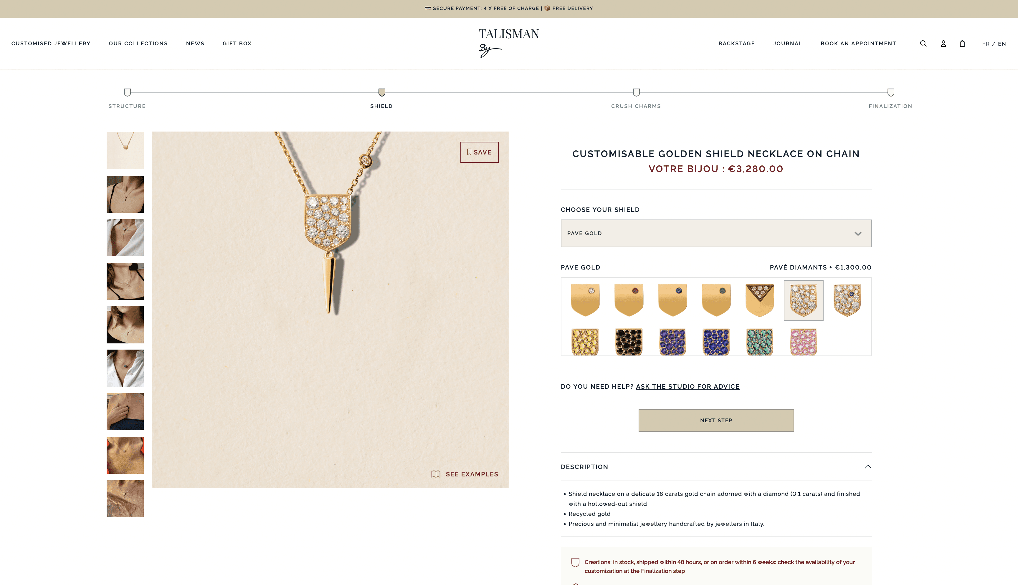
The first part of the work was to try to reduce the number of steps to the minimum, while still having a comprehensive flow. We divided it in five parts.
First, you choose a structure (necklace, earrings, ring, …). That’s when the customizer loads. You can choose the type of gold (gold, rose, silver) and the size of the shield (the central piece of the jewel, what differentiates Talisman By from other jewelry houses).
You can then customize the shield, from tens to hundreds possibilities are offered. There's even an option to engrave it! Then, time to pick a charm, the hanging piece of the jewel. Review it, and you’re good to go! Depending on the structure, you can add multiple shields and charms.
We didn’t want to lose clients that didn’t have the time or the will to have a customized jewel. That’s why we also offer premade configurations on the shop.
Cutout pieces have to be perfectly positioned in the square composition, so we exported square PNGs with transparent paddings. We then just had to stack the different layers, from background, jewel structure to charms.
It was quite easy to design the desktop version. You can see the dynamic preview of your jewel on the left, and customize it on the right side. But most of the jewelry sales made online happen on mobile.
We had to fit the preview, the customizer nav, as many options as possible, and the tab bar above the fold. The top nav is hidden by default to save space, but can be displayed by scrolling up.
Because of technical limitations, we had to keep the same ratio for the preview between desktop and mobile, so it fits on a full width square, the perfect size to clearly see the customization. Options are then stacked under it, so most of the time you can still see the preview when you customize it. We didn’t want to fix It’s followed by more generic modules, such as description, Q&As and footer. We fixed the tab bar, showing the name of the product, its price and a next step button, so the user is never stuck and easily see how his choices impact the price.

It’s not perfect, but that’s the best compromise we found, and it worked well with clients after launch!
Make a fresh, youthful web brand thrives in an environment composed of physical stores
Jewelry houses sometimes feel distant for everyday people. For some, luxury has to feel elitist, meaning distant and cold. It’s sometimes part of their branding and tone of voice.
We didn’t feel that way, wanting to bring luxury to as many people as possible, with a more friendly and accessible brand.
But where is the threshold between accessible and precious, in a field where brand recognition makes most of the price. We had to feel youthful and friendly, but serious, unique and quality driven at the same time.
We used a few tools to do so: while colors and fonts are pretty classy, yet solar, we brought an accessible tone of voices, warm photoshoots.

We also integrated tools that are generally not expected from that kind of companies. You can use referrals to invite people and earn points that you can spend of the shop. There’s a form, full of images focused on who you are, that you can fill to receive customized propositions matching your personality.
The house made collaborations with French artists for new collections.
What I learned
Talisman By was my first big scale project, and being able to work on it from the very first brainstorming about what we wanted the website to offer to the launch, and even iterations now was a very learning and fulfilling experience.

Mar 1, 2023

Mar 1, 2023

Mar 1, 2023

Mar 1, 2023

Mar 1, 2023

Mar 1, 2023

Mar 1, 2023

Mar 1, 2023

Mar 1, 2023

Mar 1, 2023

Nov 14, 2021

Oct 24, 2021

Jun 29, 2021

Sep 16, 2020

Jul 8, 2020

Jun 22, 2020

Jun 1, 2020

May 24, 2020

May 3, 2020

Mar 31, 2020

Mar 14, 2020

Mar 15, 2020