Freelance / Product Design
Magma
The project
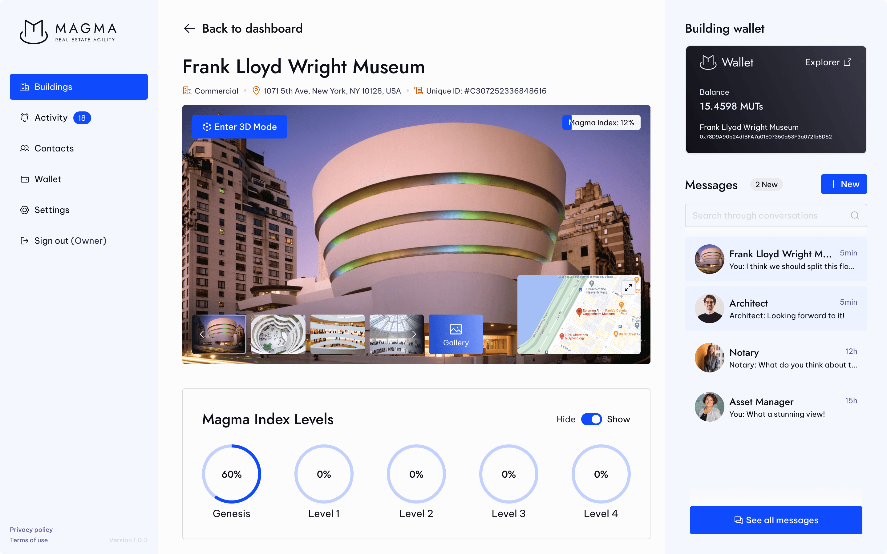
We are building a web based real estate management tool, to help asset managers manage their buildings easily, by offering a 3D digital twin of buildings. Magma’s digital twin will function as a unique source of truth for the building. The product should be released early 2023. You can have a glimpse of it at https://thisismagma.com/ (the website was designed and developed by an agency, as I am focused on the design of the platform).
My contribution to the project
I participated in workshops to help define the unique value proposition of the company
I defined the identity of the new company
I turned product and service ideas into flows and I challenged the ideas with the team to push the product further
I designed the platform (user flow, UX, UI, prototype)
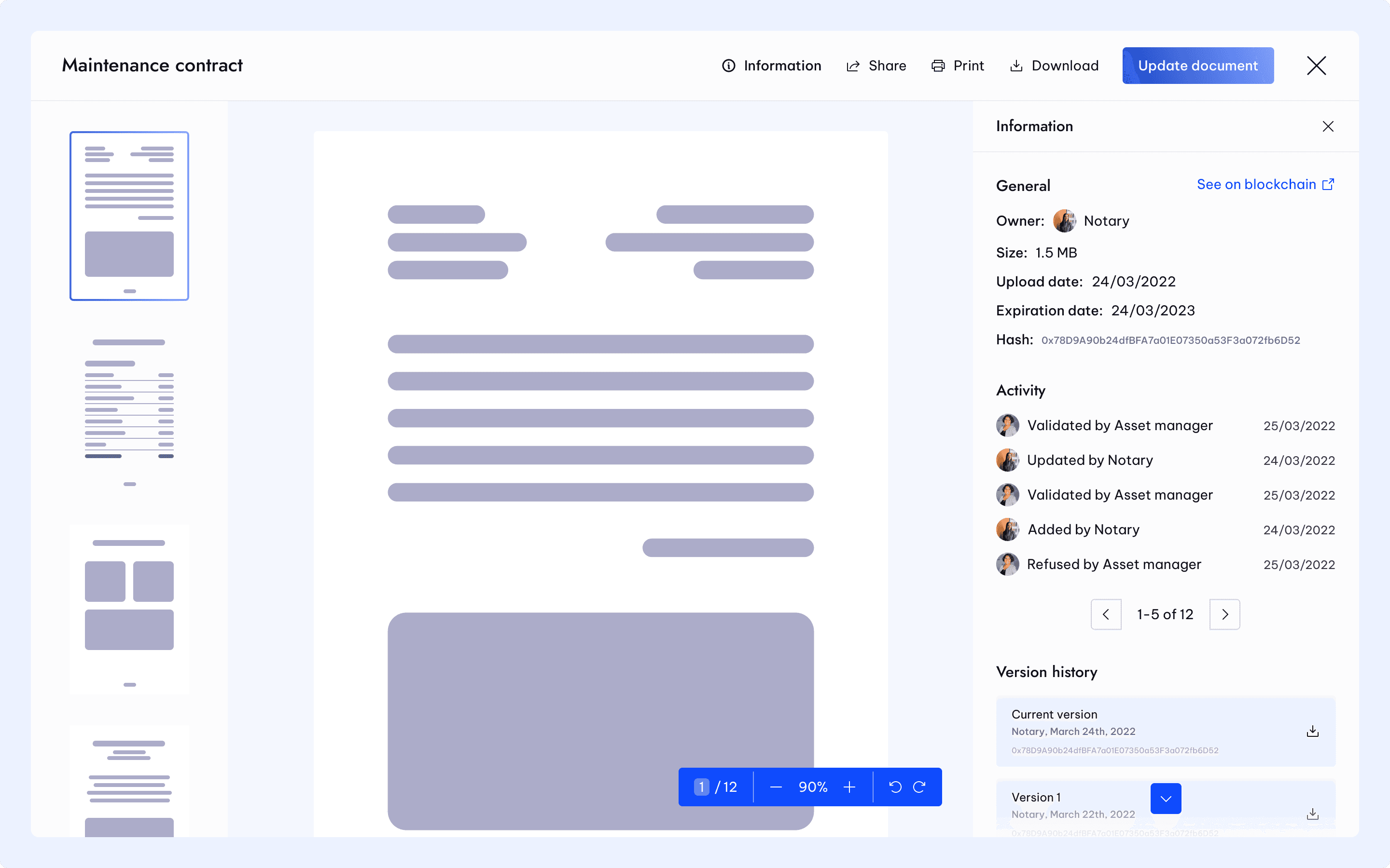
I created a complete and flexible design system
We are still working together on the future versions of the product
Challenges
Magma is my biggest project yet. When I joined the journey, everything was yet to be defined but the vision, to modernize and facilitate building management, a field that didn’t see big innovations in ages.
Focus on what really matters for launch
When we did the first workshops and talked about the future of the product, we quickly saw that we could add features for years or even decades. Our main task was to find what would bring the most value to V1, the core features that would differentiate us from competitors. As the V1 is reaching the end of development, we are already designing the next version. We also took the time to clearly define the company's brand, something that we didn't do extensively at first because we were focused on defining the product and quickly designing to kick-off development and avoid any bottleneck.

V2 design looks way better, it brought a personality that was missing on V1 because we focused on features and UX.
Looking at the scale of the project, I knew I had to create a design system. We would have tens to hundreds of frames, and all kind of components with many states, something that would be unmanageable without a proper design system.

Figma brought powerful tools to the table that helped me create a flexible design system, for example auto layout that allowed me to create an all-in-one component for modals that would guarantee consistency across all the platform.
What I learned
My biggest learning from this project so far is that there is a time for everything. I wanted to have a clean branding, an extensive design system, when it wasn't the time to do so.
The branding could wait because we quickly needed tens of wireframes to start developing.
The design system didn't really make sense back then and took me a lot of time, because I was cleaning and organizing things that changed or were deleted from one week to another as we were challenging the product.
I can now better apprehend and adapt design processes to the project needs.
Mar 1, 2023
Mar 1, 2023
Mar 1, 2023
Mar 1, 2023
Mar 1, 2023
Mar 1, 2023
Mar 1, 2023
Mar 1, 2023
Mar 1, 2023
Mar 1, 2023
Nov 14, 2021
Oct 24, 2021
Jun 29, 2021
Sep 16, 2020
Jul 8, 2020
Jun 22, 2020
Jun 1, 2020
May 24, 2020
May 3, 2020
Mar 31, 2020
Mar 14, 2020
Mar 15, 2020


