
Agency / UX-UI
Coup de coeur francophone - Website

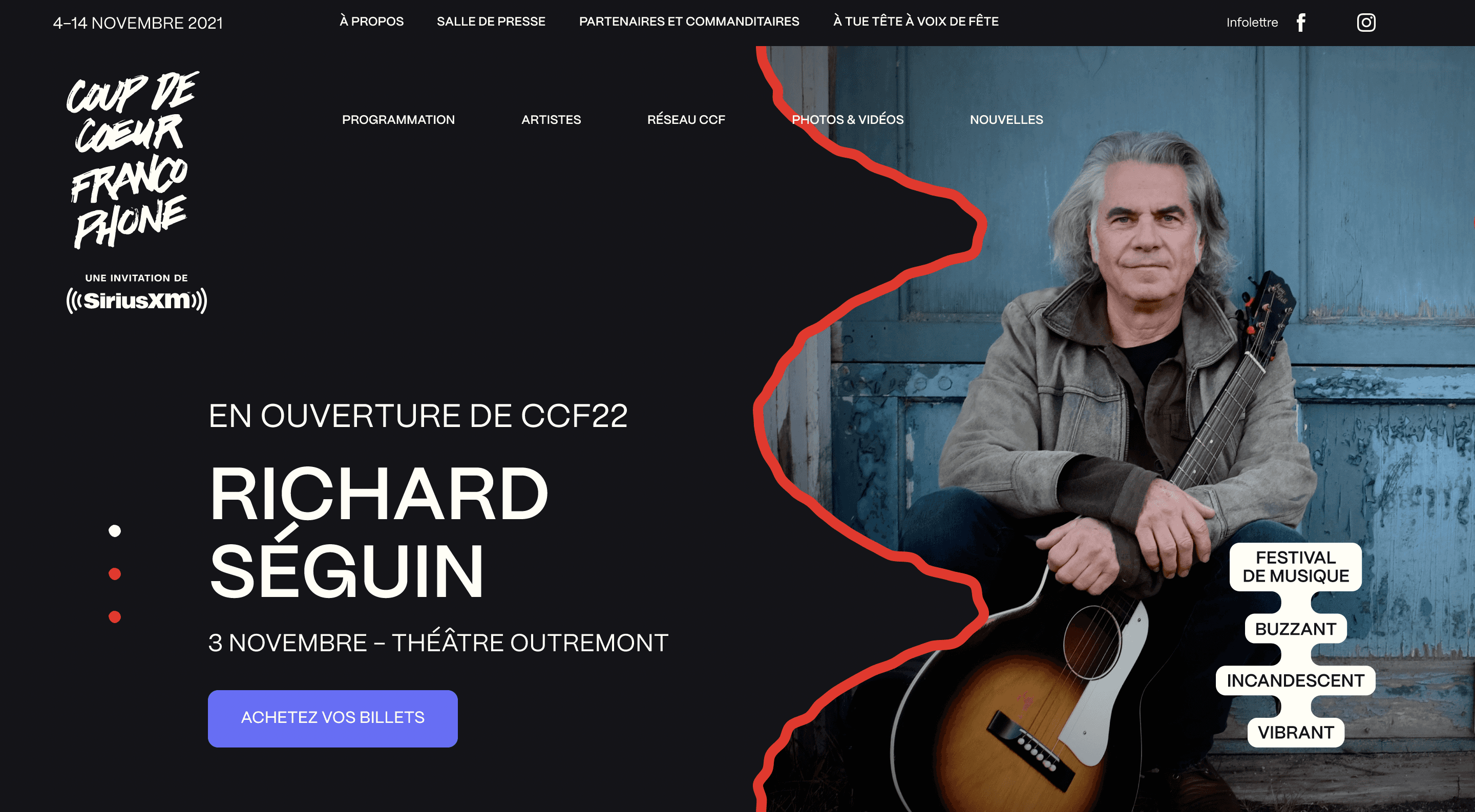
The project
Coup de coeur francophone is a French song festival held every year in more than 45 Canadian cities, from Montréal to Vancouver. Akufen has been working closely with the festival for years, providing branding, website, prints, promotional videos… We create a new branding for each edition to give each year its own personality. The new identity, playful and dark, was defined by a talentuous artistic director from Akufen.
I was responsible of the new version of the website, and of the production of multiple motions.
The project is live at https://coupdecoeur.ca/
My contribution to the project
I migrated the mockups of the previous edition from Sketch to Figma
Using the same design structure, I reworked the mockups with the brand of the new edition of the festival, keeping the UX mostly the same but reworking the UI
I created a proper design system to have scalable mockups, it's now ready for the next rebrand
Challenges
Coup de coeur francophone is a particular project, web design wise. We made the same structure evolve from year to year, will give life to a new identity and spreading it to many different mediums.
Switch from Sketch to Figma
I began by importing the previous version's design from Sketch to Figma. Akufen used to work on Sketch, but switched to Figma the year prior. We could have updated the Sketch file, but as we will reuse the file year after year, I wanted us to have a clean support that we could easily work with for the next version.
A lot of components and frames had to be cleaned up because Figma and Sketch doesn't handle components and frames the same way. I also took this opportunity to set up a complete design system that we'll be able to reuse and update with the new branding next year.
Bring a fresh touch to the website without redeveloping everything
What we do for the website each year is more a skinning that a new website. We keep the same technical stack, mostly the same pages and UX, and work on the look of the website.
As I switched from Sketch to Figma, I took the time to clean everything: spacings, component size and behaviors, everything was defined and fixed with multiple state components. The UX didn't change much, most of the effort was put on illustrations, hover effects, border styles, tiny animations…
What I learned
Working on the website of Coup de coeur made me confirm what I thought was important, that preparing a clean design structure can save a lot of time later on.

Mar 1, 2023

Mar 1, 2023

Mar 1, 2023

Mar 1, 2023

Mar 1, 2023

Mar 1, 2023

Mar 1, 2023

Mar 1, 2023

Mar 1, 2023

Mar 1, 2023

Nov 14, 2021

Oct 24, 2021

Jun 29, 2021

Sep 16, 2020

Jul 8, 2020

Jun 22, 2020

Jun 1, 2020

May 24, 2020

May 3, 2020

Mar 31, 2020

Mar 14, 2020

Mar 15, 2020